Custom Widgets
The Robotic Data Automation Fabric (RDAF) platform allows users to create dashboards by defining them in JSON. With the release of version 8.0, RDAF now supports Micro-frontends, enabling users to incorporate new widgets and dashboards using popular UI frameworks like Vue, React, or others. This upgrade offers a more flexible and scalable architecture, making it easier to build and customize dashboards to meet specific needs.
Dashboard Structure
A dashboard is built using multiple parts, including attachments and custom widgets (also called micro-frontends). Attachments can be various file types, such as JSON, HTML/CSS, JavaScript, or any other text-based formats. These components work together to create the dashboard's functionality and design.
1. Custom Widgets
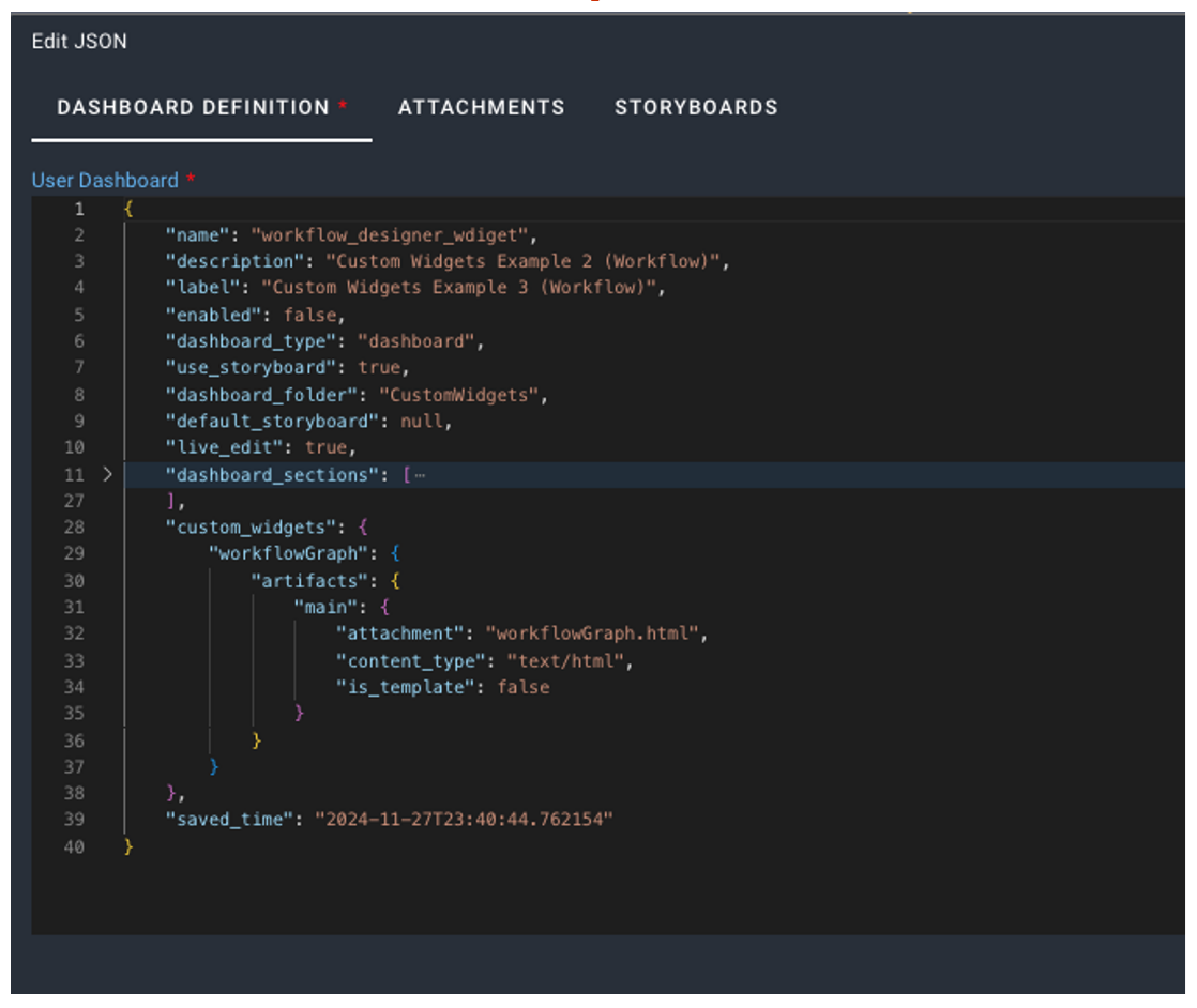
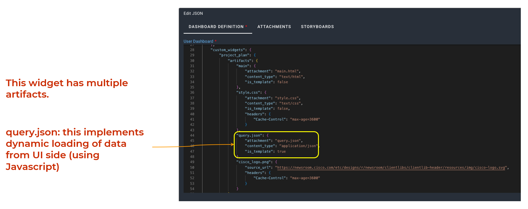
Custom widgets are added to a dashboard by defining them in the custom_widgets section of the dashboard's JSON structure. These widgets can include various resources, such as HTML templates, JavaScript files, and other assets needed to display and function properly. This setup allows for flexible and reusable components that can be tailored to specific dashboard needs.
2. Creating Custom Widgets
Important
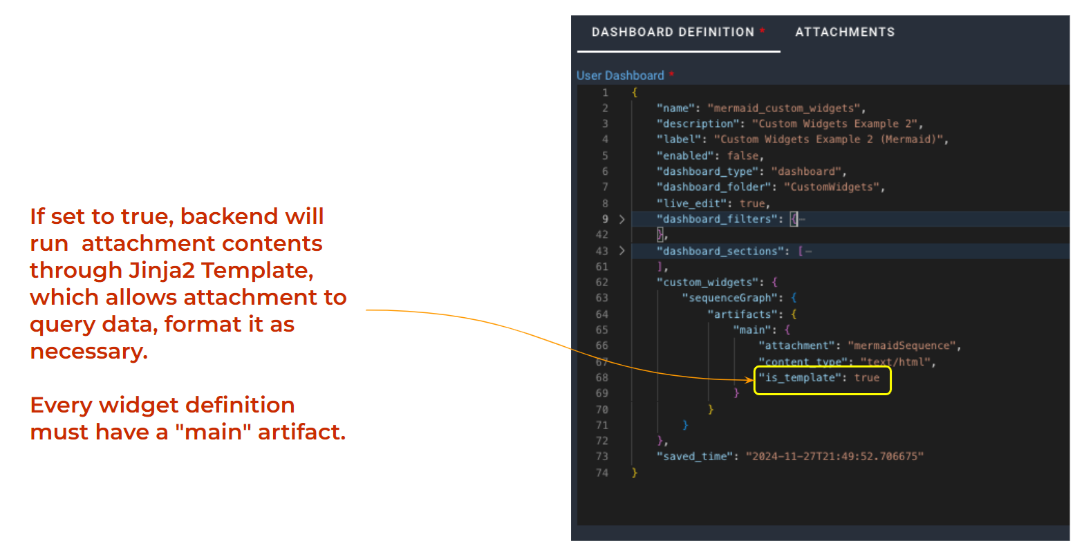
Each custom widget must have one artifact named main, which typically contains an HTML attachment. This HTML file serves as the starting point of the widget and is essential for proper functionality. This HTML file serves as the starting point of the widget.
Creating Custom Widgets involves developing personalized components that enhance user interaction and display tailored data or functionality. These widgets are built to meet specific requirements within an application or interface.
For a wide variety of custom widgets and examples click here.
"custom_widgets": {
    "gauge_display": {
        "artifacts": {
            "main": {
                "attachment": "index.html",
                "content_type": "text/html",
                "is_template": false
            },
            "main.js": {
                "attachment": "main.js",
                "content_type": "text/javascript",
                "is_template": false
            }
        }
    }
}
Explanation of Attributes
Attributes |
Description |
|---|---|
custom_widgets |
This defines the custom widgets used in the dashboard. Here's a breakdown of how it works: |
gauge_display |
This is an example of a widget name. Each widget must have a unique identifier to distinguish it from others. |
artifacts |
This section contains references to the widget's resources, such as HTML files, JavaScript files, or other assets needed for the widget to function. |
attachment |
Specifies the filename of the asset (e.g., script.js or template.html). |
content_type |
Defines the MIME type of the asset, such as text/html for HTML files or text/javascript for JavaScript files. |
is_template |
A true/false flag that indicates whether the asset is a template. If true, it means the asset supports dynamic content processing. |
3. Using Custom Widget in the Dashboard
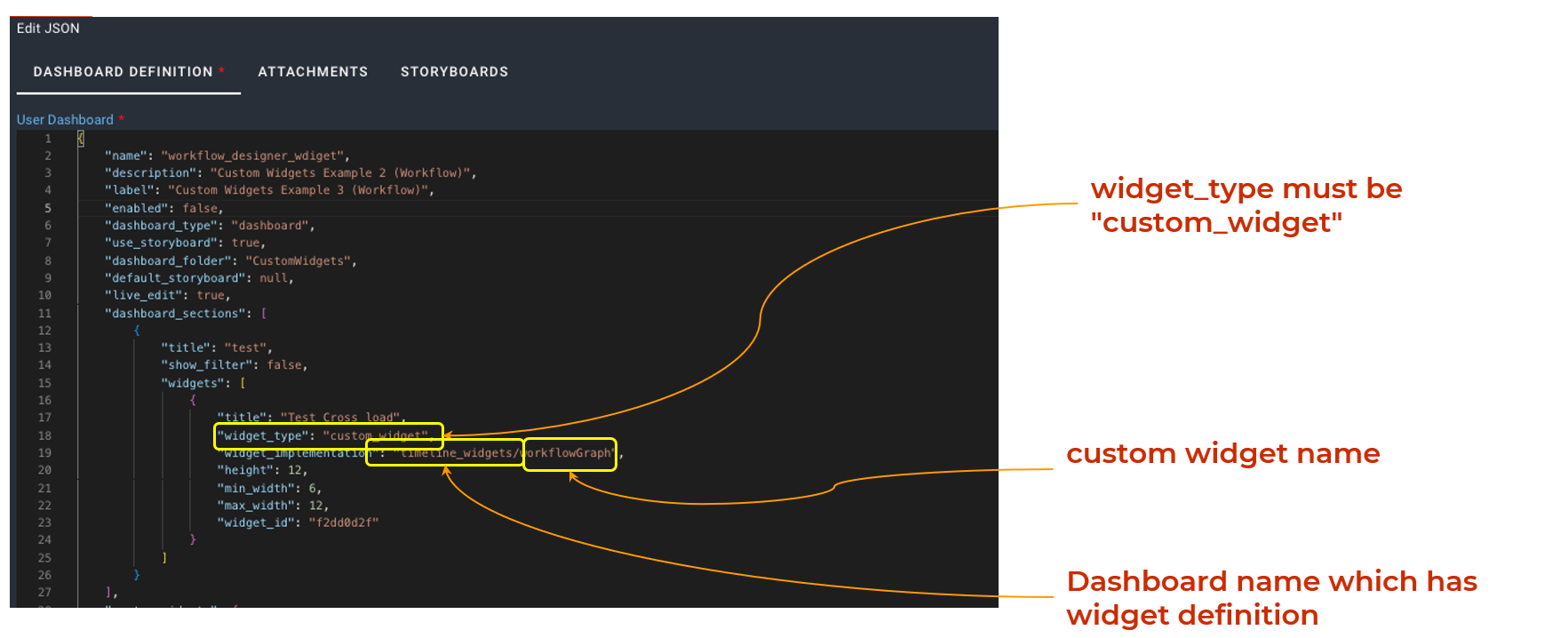
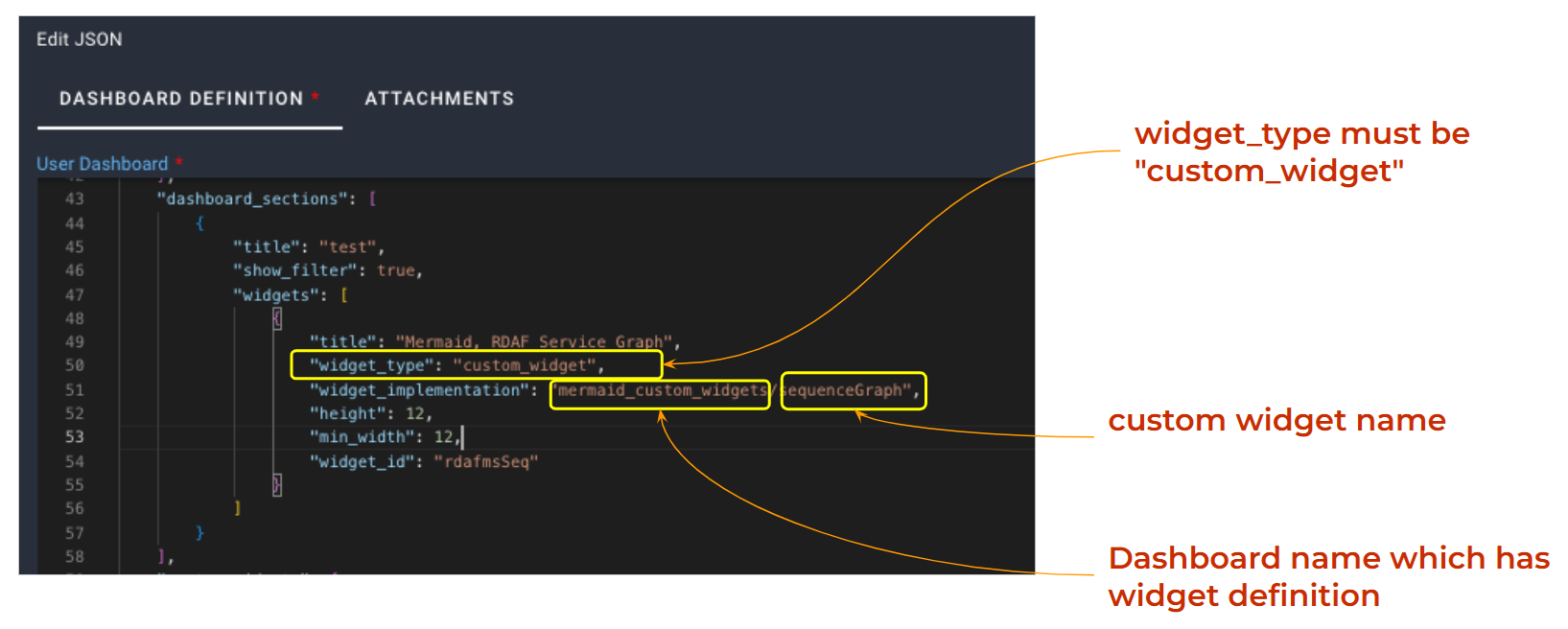
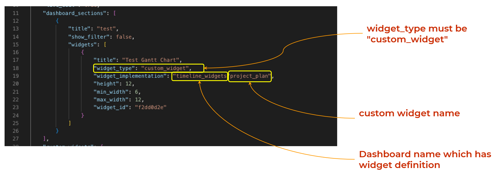
The following code snippet shows how to include a custom widget in the dashboard definition. By adding this widget, user can enhance the dashboard’s functionality with personalized features. This process allows user to integrate their own widgets seamlessly into the dashboard layout.
{
  "dashboard_sections": [
    {
      "title": "Workflow Steps",
      "widgets": [
        {
          "title": "Workflow View",
          "widget_type": "custom_widget",
          "widget_implementation": "workflow_details_viewer/workflow_viewer",
          "widget_id": "accfc497",
          "min_width": 5,
          "max_width": 5,
          "height": 18,
          "fixed_variables": {}
        }
      ]
    }
  ]
}
Explanation of Attributes
Attributes |
Description |
|---|---|
dashboard_sections |
Defines the different sections or areas within the dashboard. Each section acts as a container for related widgets, allowing logical grouping and organization of content. |
title |
Provides a title/heading for a specific dashboard section, helping users understand what the section is about. For example, a section called Customer Insights would group widgets displaying customer-related data. |
widget_type |
Specifies the widget's type. Here it is custom_widget, which tells the reporting engine to route rendering to the custom-widget handler instead of a built-in widget (pie, tabular, timeseries, etc.). |
widget_implementation |
A logical reference of the form <widget_library>/<widget_name> (e.g. workflow_details_viewer/workflow_viewer). It resolves to an entry under the dashboard's custom_widgets section, whose HTML/Jinja artifact is rendered and embedded in an iframe. |
min_width / max_width |
The minimum and maximum width the widget can occupy, expressed in grid columns on a 12-column layout (defaults: min_width 6, max_width 12), not pixels. |
height |
The widget's height in grid row units (default 8), keeping a consistent vertical size within the dashboard layout. |
fixed_variables |
A dictionary of inputs passed to the widget. |
4. Attachments
-
Each dashboard can include various attachments that help define the look and behavior of the widgets.
-
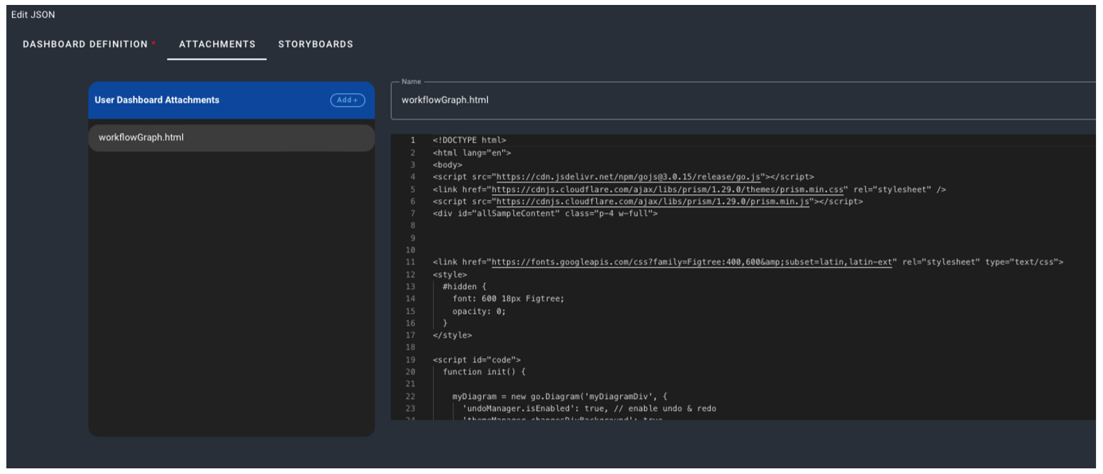
Attachments can be JSON, HTML, CSS, JavaScript, or any other text-based content required for rendering the dashboard.
-
These Attachments are linked to the dashboard or its widgets, providing the necessary resources for rendering and functionality.
-
They are typically referenced in the dashboard configuration or widget definitions, helps in creating dynamic, interactive, and visually appealing dashboards tailored to user's specific requirements.
5. Micro-frontend Support
With the adoption of micro-frontend, users gain the flexibility to:
-
Leverage any UI framework (such as Vue, React, or Angular or plain HTML/CSS) to develop and integrate widgets, enabling teams to use the tools they are most comfortable with.
-
Define custom widgets through the custom_widgets attribute, allowing for tailored functionality and design to meet specific needs.
-
Attach necessary assets (HTML, JavaScript, and CSS) to ensure the widget operates seamlessly and aligns with the application’s visual style.
This enables effortless extensibility and customization of dashboards within RDAF, allowing new UI components to be integrated seamlessly without the need to alter the core platform. This modular approach enhances flexibility, accelerates development, and ensures the platform remains future-proof.
6. Custom Widgets Examples
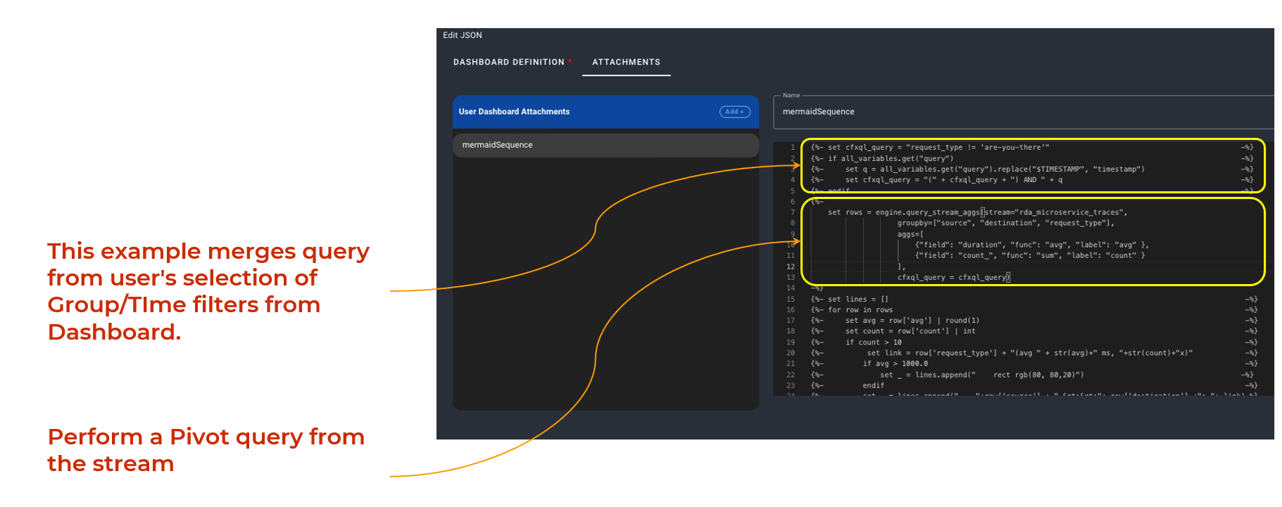
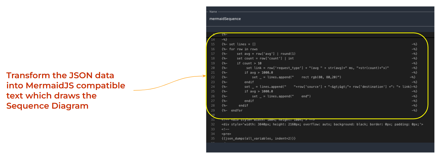
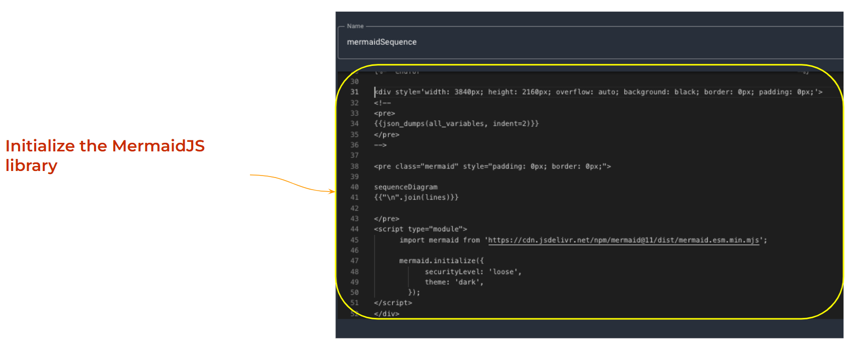
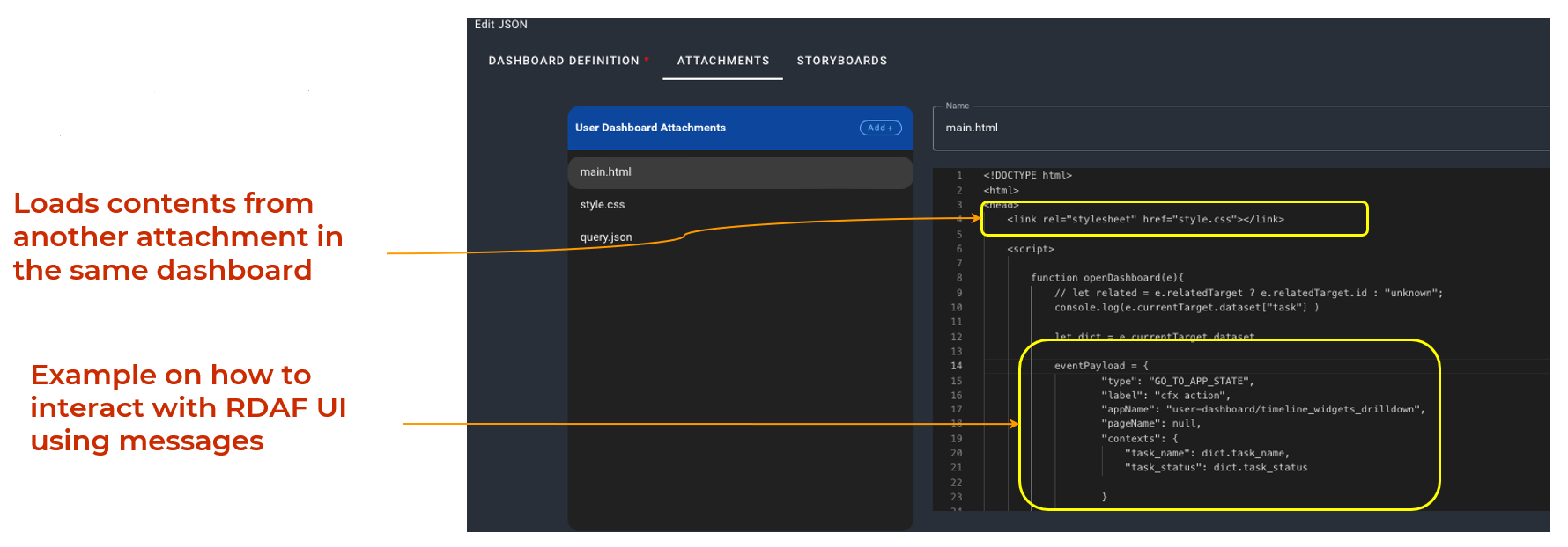
a) Sequence Diagram Widget: Static data loading during initialization, with group/time filters, uses an external JS library.
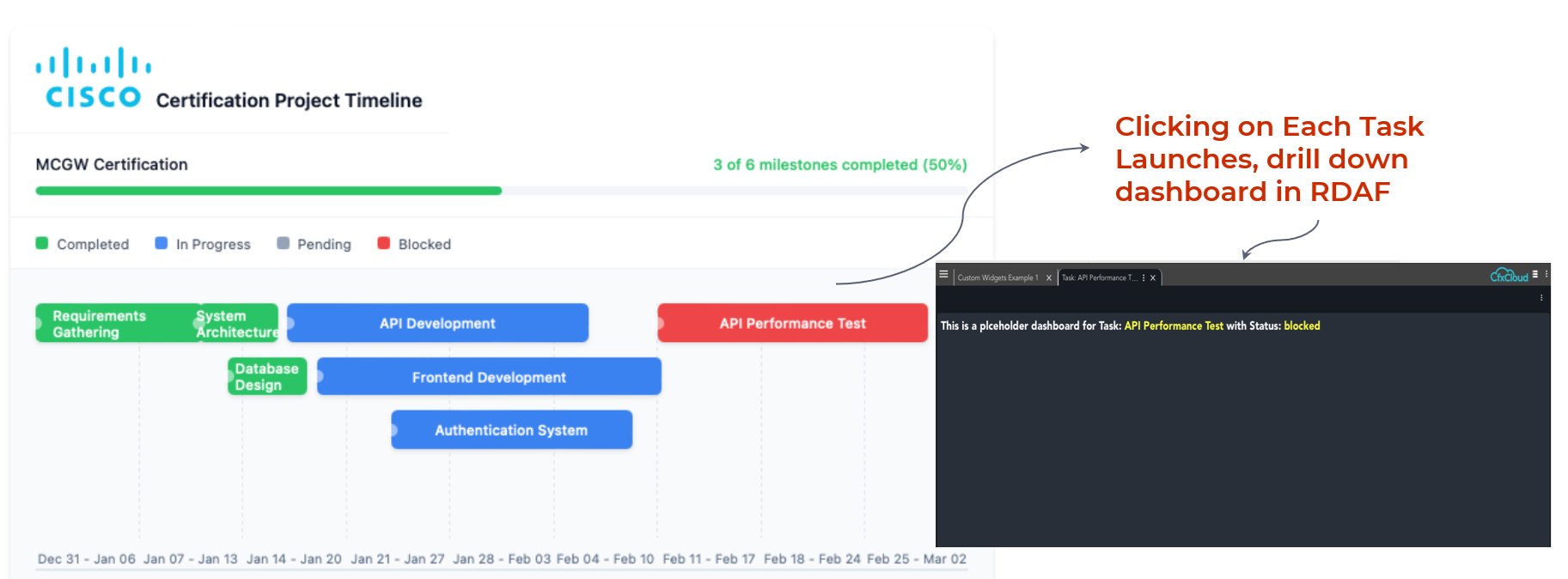
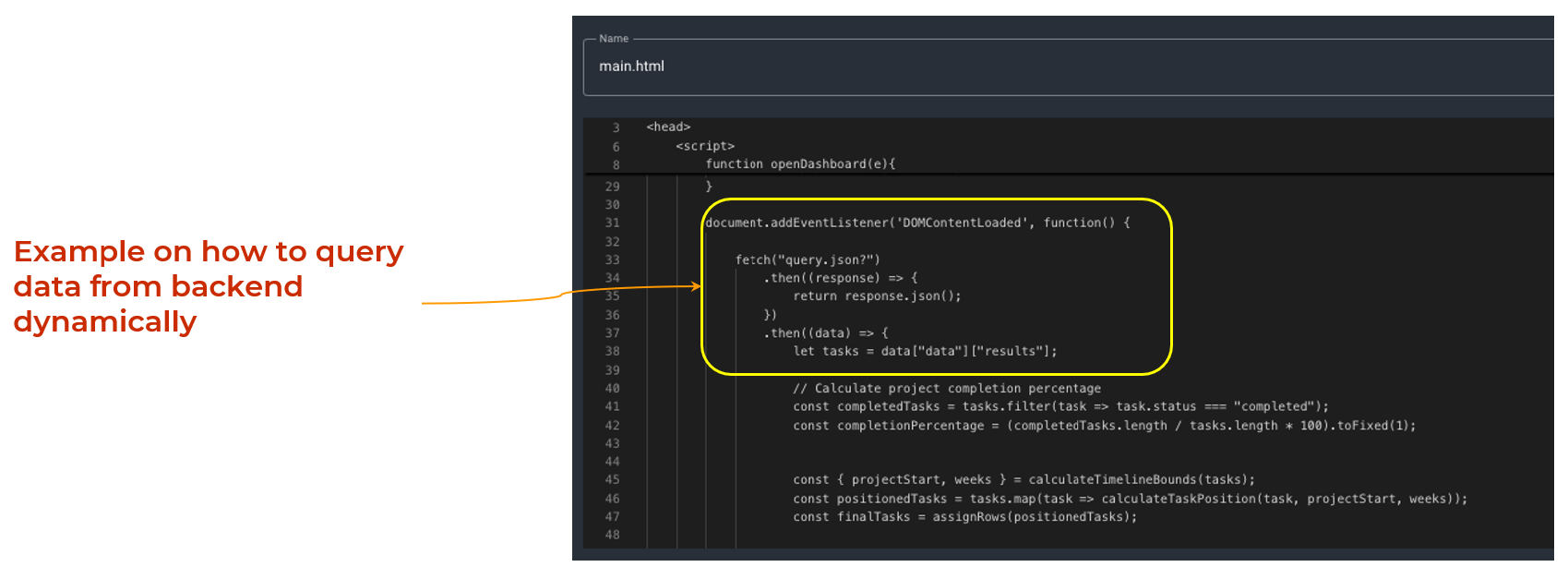
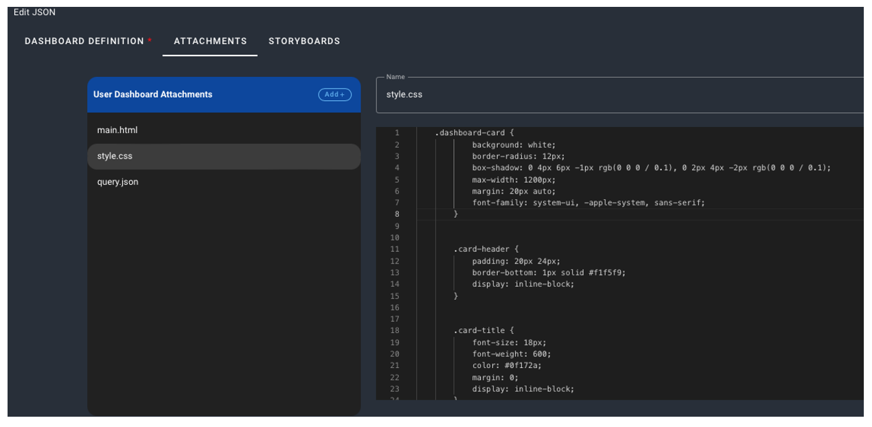
b) Gantt Chart (Project Plan): Dynamic data loading, external CSS, and JS from an attachment — more interactive.
c) Workflow Designer Widget: Relies on an external JS library but doesn’t use dynamic JS loading, RDAF interaction, or attachments.
Feature |
Sequence Diagram | Gantt Chart | Workflow Designer |
|---|---|---|---|
| Uses external JS library | Yes | Yes | |
| Uses JS code from attachment | Yes | ||
| Interacts with RDAF UI | Yes | ||
| Loads Data During init time | Yes | ||
| Loads data Dynamically in JS | Yes | ||
| Uses Group and Time Filters | Yes | ||
| Uses CSS as additional attachment | Yes |
6.1 Sequence Diagram Widget
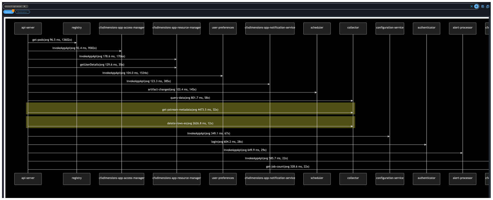
1) Features Used by Sequence Diagram Widget
-
External Javascript Library.
-
Data coming from RDAF Persistent Stream.
-
Data Populated into Widget during Widget Loading time.
-
Apply group filters and Time filters for custom widgets.
2) Data Used by this example
-
Uses Stream
rda_microservices_traces -
This Stream is part of every RDAF System
6.2 Gantt Chart
1) Key Features used in Gantt Chart
Prebuilt JavaScript Code: A ready-to-use JavaScript implementation is provided as part of the attachment.
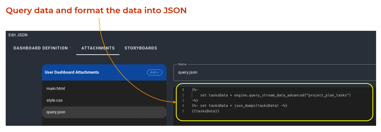
Real-Time Data Streaming: Data is sourced from the RDAF Persistent Stream for continuous updates.
Dynamic Data Loading: Data is fetched from the backend on-demand, ensuring up-to-date information.
Seamless Dashboard Integration: Supports cross-launching other RDAF Dashboards based on user interactions.
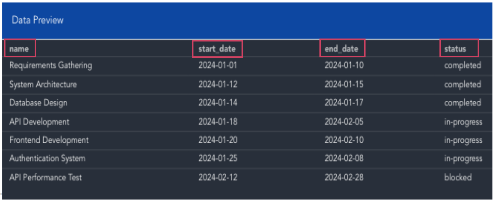
2) Data Used by the Gantt Chart example
Custom data in a stream with following columns
-
name
-
status
-
start_date
-
end_date
6.3 Workflow Designer
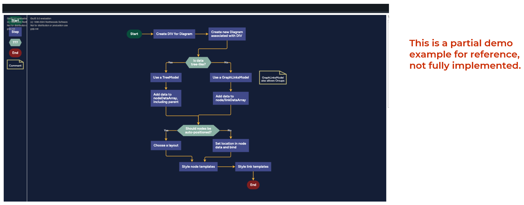
Features Utilized in This Example:
-
External JavaScript Library: The example integrates an external JavaScript library to enhance functionality, such as handling UI interactions, data visualization, or utility functions.
-
Self-Contained Example: The example is designed as a standalone implementation, containing all necessary code, assets, and logic within itself.
Data Utilized in This Example:
-
Hard-Coded Data: The example includes static or predefined data embedded directly within the code.
-
User-Editable Data (Through UI): The example allows users to input or modify data dynamically via the user interface.